When Walls Speak in Color
The shades, tones, and subtle hues influence mood, memory, and the spirit of home
The Language Beneath the Surface
Color does not simply decorate a room. It narrates it. The pigments we choose shape how we feel, how we think, and even how we move through space. Every shade carries a psychological signature that extends beyond aesthetics. A pale wall can soothe, a deep hue can enclose, and a balanced combination can create harmony between architecture and emotion. When designing interiors, color becomes a language more powerful than furniture or layout, because it speaks directly to perception. Understanding this visual psychology allows the home to act as an emotional mirror, reflecting the rhythms and energies of its inhabitants.
The human brain responds to color instinctively. Studies show that hues trigger physiological reactions, heart rate, alertness, appetite, without conscious effort. Yet beyond biology lies symbolism. Each culture assigns meaning to color differently, layering emotional associations over natural instinct. The challenge for homeowners is to translate these layers into a personal dialect of comfort. A wall painted green may recall calm forests for one person but evoke school chalkboards for another. Thus, color design becomes intimate, guided as much by memory as by science. To truly master color in interiors is to understand not only hue and light, but also story and self.
When seen through this lens, choosing a room’s palette becomes less about style and more about feeling. Each space carries a specific emotional purpose, rest, connection, focus, or inspiration, and color becomes the bridge between intention and atmosphere. This is the foundation of room color psychology: the study of how our surroundings silently influence who we become within them.
The Serenity of Blue
Blue, perhaps more than any other color, embodies calm. It is the color of open skies and deep waters, vast spaces that quiet the mind. In interiors, blue creates psychological distance, expanding perception and inviting reflection. Light tones of blue soothe, while deeper shades bring gravitas and introspection. Bedrooms and study areas often benefit from its cooling influence, encouraging rest and clarity. The color’s connection to stability and trust also makes it ideal for spaces that demand focus or composure.
However, blue’s serenity requires balance. When overused, particularly in darker or colder forms, it can drift toward melancholy. The addition of warmth, through natural textures, soft lighting, or complementary hues such as tan or cream, restores comfort without diminishing tranquility. In coastal or minimalist designs, blue anchors simplicity, turning emptiness into openness. Its quiet presence enhances air and space, allowing light to breathe through the room. The secret lies in tone selection and proportion. Blue should feel like air in the lungs, not water over the head. Done well, it becomes a quiet anthem for peace, cooling both space and spirit.
In its subtlest variations, blue also evokes memory. It recalls distance, nostalgia, and longing. Used thoughtfully, it can create a sanctuary where time seems to slow. For homes that crave stillness amid modern pace, blue remains the timeless answer.
The Warmth and Energy of Yellow
Yellow lives where optimism begins. It carries sunlight into walls, turning dull corners into living spaces that hum with vitality. Psychologically, it stimulates energy and creativity, lifting spirits and sharpening awareness. Kitchens and studios often benefit from yellow’s brightness, where productivity meets joy. Even in small doses, through accents, artwork, or upholstery, yellow infuses rooms with gentle enthusiasm. Its psychological power lies in its ability to brighten mood without overwhelming, creating an emotional warmth that feels natural rather than forced.
Yet yellow’s energy can easily tip into intensity. Overuse or saturation may cause agitation rather than inspiration, particularly in confined spaces. To temper its brightness, designers often pair it with grounding neutrals such as gray, wood tones, or muted green. The contrast creates equilibrium, allowing yellow to radiate without glare. Pale butter shades invite calm conversation, while golden ambers add sophistication. This versatility makes yellow one of the most adaptable emotional tools in interior design. It uplifts the mind yet comforts the body, transforming interiors into reflections of sunrise, places that promise renewal every day.
In the darker months, yellow performs an emotional service. It simulates natural light, countering seasonal gloom. Even a small accent wall or decorative object can recreate the feeling of morning warmth. Its joy is not childish but elemental, reminding us that the simplest form of happiness often begins with brightness.
The Grounded Strength of Earthy Neutrals
Neutral tones, beige, taupe, sand, clay, and soft brown, form the quiet foundation of interior psychology. They are neither passive nor plain. Instead, they ground emotional experience, offering stability and safety. Earthy colors connect the mind to nature’s consistency, evoking soil, stone, and wood. In a world of constant motion, such hues provide a sense of permanence. They allow the mind to rest, creating calm through familiarity. Unlike bold shades that demand attention, neutrals invite stillness, making them perfect for living rooms, hallways, or shared spaces that require gentle cohesion.
The strength of neutrals lies in their flexibility. They act as visual pauses between stronger tones, allowing accent colors to resonate. Combined with texture, woven fabrics, ceramics, unfinished wood, they gain depth and warmth. In modern interiors, where light and space dominate, neutrals prevent sterility by introducing quiet emotion. They do not compete for notice, yet their absence would be deeply felt. The psychology behind these tones lies in their invisibility: they frame emotion rather than define it.
In spiritual terms, neutral shades represent balance. They embody acceptance and simplicity, qualities often lost in overstimulated environments. Through their quiet restraint, they allow emotion to exist without chaos, turning rooms into havens of grounded peace. To live among such colors is to feel the calm assurance that comes from belonging to the earth itself.
The Passion and Power of Red
Few colors elicit stronger reactions than red. It is primal, the color of fire and life, commanding attention and energy. In the psychology of interiors, red stimulates both emotion and movement. It quickens pulse and heightens appetite, making it a traditional favorite for dining rooms and social spaces. Its presence fills rooms with vitality and warmth, creating intimacy where conversation flows freely. Yet its power must be handled carefully. Too much red can overwhelm, producing restlessness or even tension. The key lies in controlled contrast and mindful application.
Deep reds, such as burgundy or brick, exude sophistication and comfort. They carry the romance of old libraries and candlelit evenings. Lighter reds lean toward playfulness, adding spark without drama. When paired with darker woods or metallic finishes, red creates elegance rooted in confidence. It energizes without aggression, transforming space into experience. However, red demands sensitivity to lighting. Natural daylight enhances its depth, while artificial light can distort tone. Proper balance ensures that the color’s emotional intensity remains warm, not oppressive.
Psychologically, red represents passion and presence. It connects people to their physical selves, heightening awareness of life and interaction. Used sparingly, it becomes unforgettable. Red teaches that emotion, when focused rather than scattered, can turn ordinary spaces into vibrant expressions of living.
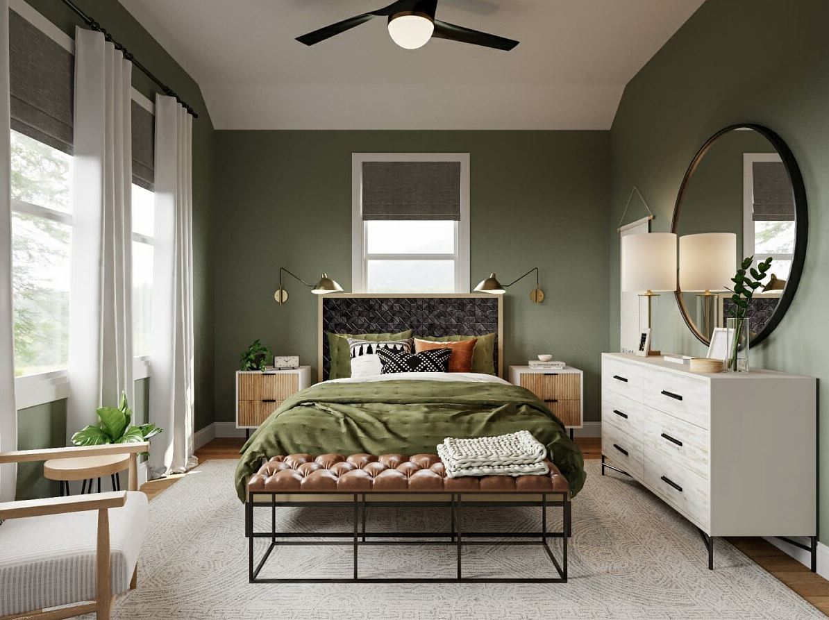
The Balance and Renewal of Green
Green stands between warmth and coolness, embodying equilibrium. It is the color of growth, resilience, and renewal. In interiors, it symbolizes restoration, emotional, mental, and physical. Rooms dressed in green feel connected to nature, reminding inhabitants of forests, fields, and the rhythm of life. The human eye rests easily on green, which explains its calming yet revitalizing power. Psychologists often associate it with balance and stability, making it ideal for bedrooms, offices, and transitional spaces where clarity is desired.
The tone of green dictates its influence. Soft sage tones evoke quiet comfort, while richer emeralds communicate luxury and depth. Muted olive lends warmth and maturity, while mint offers freshness. Green’s adaptability allows it to harmonize with nearly every other color family. When paired with neutrals, it feels organic. Combined with blue, it cools. Matched with gold or coral, it becomes expressive and lively. This flexibility reflects its psychological essence: growth through harmony. Green invites renewal not through intensity but through patience, mirroring the steady rhythm of nature itself.
To live within green is to dwell within balance. It fosters mindfulness, encouraging reflection without stillness. The color heals through familiarity, bridging human emotion with the enduring calm of the natural world.
The Subtle Drama of Gray and Black
Gray and black occupy unique territory in the emotional landscape of color. They represent contrast, structure, and sophistication. Where bright colors express emotion, these tones frame it. Gray provides neutrality, softening transitions between vivid shades. It creates focus and modernity, a quiet canvas for texture and form. When layered in gradients, gray evokes subtlety, the calm between extremes. However, used carelessly, it can verge on coldness. Warm undertones and varied surfaces counter this by adding depth and life. The most successful gray interiors feel refined, not sterile.
Black, meanwhile, commands respect. It symbolizes strength, confidence, and mystery. In small doses, it defines space with precision. A black-framed window, a painted accent wall, or matte cabinetry introduces drama without chaos. Black absorbs light, grounding composition and providing rest for the eye. Its psychological power lies in its duality: both protective and daring. Yet balance remains crucial. Excess darkness can shrink perception or stifle emotion. When paired with contrast, white trim, metallic highlights, or natural materials, black becomes not void but voice, anchoring space with clarity.
Together, gray and black form the architecture of visual psychology. They are the punctuation in the sentence of color, guiding rhythm and meaning. Their sophistication comes from restraint, proving that emotion need not always shout to be deeply felt.
The Home as a Living Palette
Color psychology transforms interiors from decoration into dialogue. Each wall, each hue, contributes to the emotional cadence of life within. When chosen with awareness, colors transcend style, shaping identity and behavior. The home becomes more than shelter, it becomes narrative, a living composition of mood and meaning. Blue calms, yellow uplifts, red ignites, green restores, and neutrals ground. Together, they form an orchestra of feeling conducted by light and experience. To design through color is to translate emotion into architecture, crafting spaces that reflect not only who we are, but who we wish to become. Within this symphony of hue and harmony, the home learns to speak quietly yet profoundly, telling stories that begin not with words but with color itself.